Aimee Tye's AS Media Blog
Friday, 31 March 2017
Thursday, 30 March 2017
EDITED ON 31.03.17 Q1: In what ways does your media product use, develop or challenge forms and conventions or real media product?
Conventions that we used, consisted of the following:
- Young female vulnerable victim
- Typical forest location
- Chiaroscuro lighting
- Tension building music
- Genre fitting fonts
- MacGuffin (an unused item central to the story line)
- Gender stereotypes
These stills represent the time (in each shot another number sums up for the final shot to have the complete time), and as they build up, the tension rises. The composition of the shot places the protagonist at the side of the shot emphasising the lack of power that she has as a young female character. This reinforces the convention of a young female victim who is taken and abused- also reinforcing age stereotypes of young people unable to take care of themselves, especially in dark situations as thus seen. The location is a typical forest location, used in many thriller films, further emphasising the genre of the film.
There is diegetic sound in this scene of birds and wind passing by which is mixed with the non-diegetic sounds of music which increases and decreases in sound balance to create more tension. The use of mise en scene and location makes the scene neat and put together- even with all the leaves on the ground, it still looks well presented. The mise en scene uses a clean costume, with light coloured jeans and pristine white shoes, which adds to the innocence and fragility of the character. The use of combining the music and the costume creates a crisp ambience which immerses the audience with mystery and curiosity as to what a pristine looking young girl is doing in a place like this. The conventions of a young female victim is used in thrillers such as The Disappearance of Alice Creed and Sin City.
There is diegetic sound in this scene of birds and wind passing by which is mixed with the non-diegetic sounds of music which increases and decreases in sound balance to create more tension. The use of mise en scene and location makes the scene neat and put together- even with all the leaves on the ground, it still looks well presented. The mise en scene uses a clean costume, with light coloured jeans and pristine white shoes, which adds to the innocence and fragility of the character. The use of combining the music and the costume creates a crisp ambience which immerses the audience with mystery and curiosity as to what a pristine looking young girl is doing in a place like this. The conventions of a young female victim is used in thrillers such as The Disappearance of Alice Creed and Sin City.
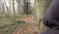 This still represents the challenging of gender stereotypes as the
antagonist's gender is not revealed- in most thriller films, the
antagonist is a male character. We chose not to disclose this element of
our film as to show that gender aside, anyone can hurt you. The
This still represents the challenging of gender stereotypes as the
antagonist's gender is not revealed- in most thriller films, the
antagonist is a male character. We chose not to disclose this element of
our film as to show that gender aside, anyone can hurt you. Thechoice not to have a gender for the antagonist meant that we could play with conventions and stereotypes of the genre and challenge them for a more diverse outcome as opposed to the typical thriller film. The composition of this shot shows both characters to the side, disregarding and power one might hold. Notwithstanding this information, the antagonist takes up much more of the screen than the protagonist which identifies the antagonist with the most amount of power in this situation. The mise en scene places the antagonist in dark clothing which adds enunciates the mystery of the character. The editing of this scene is quite slow which builds the tension and foreshadows the climax of the film. The use of a pan puts the antagonist in power as we follow their eye-line and adds to the audience's aesthetic interest as the camera is not still. As we follow the camera view, the audience are immersed as their eye-line is changing as well as the antagonist's eye-line. The use of hiding the antagonist, links to The Third Man during the sewer scene. This challenges the conventions of male dominance in thrillers and gender stereotypes.
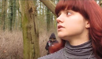 The use of placing the protagonist on the side of the shot and the antagonist in the middle of the shot, is to emphasise
the villainous aspects of their character. The antagonist looks to the side, and shows a clear sign of worry on her face, which uses the convention of a young and fragile female. The composition shows that the antagonist- although a mystery- has more power than the protagonist. The background has a leading line to the protagonists eyes which implies that we must look where she looks as to follow the story. This convention also emphasises the antagonist as they are in the middle of the geometric shaping of the trees in a triangle. The camera in this shot is still, which builds towards a climax as nothing is moving and strengthens the danger of the scene. Within the diegetic sound of this scene, we hear the protagonist sighing which adds to the tension of the scene. The editing here is slow and so adds tension, like the sigh, emphasising the impending danger and doom. This links to other films such as Sin City due to the 'hidden killer' concept where the man stabs the woman from behind her back so she doesn't know him. This reinforces the typical convention of a young vulnerable female.
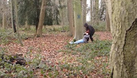 In this shot, we see the protagonist being dragged away by the antagonist. The feet of the protagonist are in the centre of the screen which draw our eye-line to the event happening on screen. This shot pushes the antagonist further to the side of the screen than the protagonist which could represent a power change, or foreshadowing of the future scenes. The composition of this shot switches the power completely. As for mise en scene, we see the entire costume for the antagonist which is all black - a typical convention for a 'villain' character. At this point, the non-diegetic is becoming much more tense and therefore creates a sense of danger, reinforcing the thriller conventions of dramatic music. The use of viewing this scene from far away contrasts to directors such
as The Coen Brothers (The Big Lebowski) who always direct close up when
an intimate scene is happening between the antagonist and protagonist. The use of showing this from far away puts emphasis on the audience as it is almost as if they are the ones watching behind a tree- immersing them fully in the story and plot. This makes them a part of the film completely
 and includes them as a 'part of the film' if you will.
The depth of field used in this shot, allows us to focus on the necklace and be unfocused on the two bodies, but are still able to see them. The necklace on the ground is a MacGuffin as it is central to the story-line after the opening of the film. (at least, in my interpretation) This means that it is an item central to the story-line that never gets used. (like in Se7en, they use a scrap of flower wallpaper). With the composition, we see both the antagonist and protagonist are in the centre of the shot, but the protagonist is in front of the antagonist which emphasises that a climax is coming and there is going to be a change. The editing has a fade to black after this scene to add emphasis as we move on to the next location (the cage). The fade encompasses the fact that the protagonist is fading away, which contrasts to the colour of the actual shot which is bright with debris. Also, opposing the next scene which is in a dark room with no diegetic sound such as the wind and birds that are in this scene. Once again, this shot uses the convention of a young fragile female character.
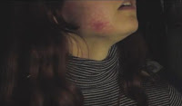 In this shot, we have an extreme close up of the protagonists face, showing a bruise on her cheek. This uses the conventions of female vulnerability and age fragility. The composition of the shot puts the protagonist in the centre of the shot which links to the climax and how we, as an audience, can sense it coming along. At this point in the film, the only sound is the non-diegetic sound due to the enclosed location, emphasising the claustrophobia of the place - creating a sense of distress and danger. The editing from this point onward has a quicker pace, which adds to the tension building and leading to the impending climax. The mise en scene of this shows the, once pristine and neat girl, as being battered and bruised- adding to the grittiness of the shot. This shot links to The Disappearance of Alice Creed, as we see Alice's bruises and battle scars too- hence using conventions of vulnerable girls in thriller films. The darkness of this scene contrasts previous shots in the forest where it was significantly lighter, emphasising the change from an alright situation of a girl in the woods, to a bad situation of a girl locked up.
 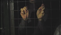 The use of this location adds to the typical location convention of somewhere dark and gritty within a thriller film location choice. Both hands are holding on to bars of a cage which are also in the centre of the shot, emphasising the importance of this character and how power has changed. The composition of this shot places the protagonist at the centre, which puts power onto her even though she is behind bars. The mise en scene is covered, and we only see her dark looking top (light jeans and white shoes not showing) which adds to the building up of the climax and impending danger which is soon. The edit at this point in time has quickened pace by a lot, and so further expressing the climax and danger that encases all her surroundings. The location gives the ambience a grittiness to it, and a high sense of fear and fragility that the protagonist is feeling. The cage positions the camera outside, which disconnects the audience from her, and connects them with the antagonist -seeing into the cage.
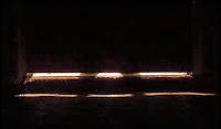
This shot uses chiaroscuro lighting which is influenced by neo-noir films such as The Third Man. This makes the film seem more obscure as there has been a lot of light in the forest, to a really dark room, to almost pitch black (then to the brightness of the last shot). We decided to use this shot because it enhances the power of the antagonist as this is the shot that makes the protagonist back away from the cage door and so reinforces the amount of power that they have left even after the composition power shift. The sound in this shot is almost at its climax, which emhasises the end of the scene, and furthers the illusion of danger in the scene. The editing here is at the same state of quickness as the last shot, which shows stability of the danger occurring. The audience switches perspective once again, as we are placed, not with the antagonist, but also not with the protagonist (or we would be behind bars), and so are placed with a third party, which once again makes them unattached them from the scene.
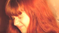 In this shot, light is used against the protagonist as a means to intimidate and petrify. In this shot, a white noise sound is used which adds emphasis on the genre for conventional music which captures the thriller genre onto the screen. The composition of this shot places the protagonist in the centre of the screen, which gives her power, but does not add to her non-existent level of control. The sound at this point is the climax of the non-diegetic soundtrack which adds to the danger and ending. There is also white noise at this point which increases the sense of risk. The editing here is fast, making the light bright and forceful- it also gives the scene jeopardy and insecurity. This links to other films that have a cliff hanger in their opening before the opening title. It uses the convention of really tense music to intimidate characters and the audience together.
 Wednesday, 29 March 2017
Wednesday, 22 March 2017
Q2: How does your media product represent particular social groups?
 |
| Figure 1 |
This convention links to other films such as The Disappearance of Alive Creed as this film also has a young female who gets taken. and so reinforcing that it is a highly used convention of thriller film.
 |
| Figure 2 |
Linking this to age representation makes it even more of a well used convention as younger characters are seen as more fragile and unable to look after themselves.
 |
| Figure 3 |
 |
| Figure 4 |
Young females are the targets of most thriller films and so get hurt along the way. In The Disappearance of Alice Creed, this is a common convention as she is constantly put in danger and is hurt. This convention is also shown within our thriller so as to make it like a real film that would be produced with the proper conventions. Seen in figure 4.
 |
| Figure 5 |
Conventionally, though, the antagonist would usually be a man. For example Essex Boys, The Disappearance of Alice Creed, Layer Cake, Sin City, and The Third Man - this is five out of the seven films we have studied, showing that 71% of the films studied use the stereotypical convention of a male villain.
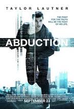 Our film taps into the commonly used trait of the teen fear of abduction. This can be seen in films such as Abduction and The Disappearance of Alice Creed. The use of taking on the aspect of teen fear, exaggerates the realism of our production, and reinforcing the facts that it can happen anywhere, to anyone. This is a common fear to teens due to their vulnerability and lack of know how as to taking care of themselves in dark situations.
Monday, 13 March 2017
Sunday, 12 March 2017
EDITED 31.03.17 Q6: What have you learnt about technologies from the process of constructing this product?
Pre-Production:
 Within pre-production and the planning area or work, we created blogs which we would put all of our work onto. We use these blogs because they are interactive as well as being flexible with usage and editing. They allow for multimedia additions such as power-points, YouTube videos, and pictures.
When researching, we watched other films and YouTube videos to help us grasp the main concept of what a thriller encapsulates. This was helpful as we were able to see what conventions there were, and how to use them- such as sounds and editing skills. As we were researching other thriller films, we used DropBox as a public share point where our teacher would upload the stills from the clips we watched so that we could easily access them and analyse them. Similarly, we used Google Drive as we were all able to access the document and edit it at the same time, making collaborative work much easier. Sites such as DaFont and FreeSound were used as they allowed us to see fonts that could be used and sounds that might work within the style of film we were making. These creatively empowering sites were copyright free for the most part, and so we were able to use any of the clips or fonts without breaking the law.
 During production, we used HD cameras which had SD cards for compact memory, as well as clear settings for zoom, and focus. There was a screed to watch back the footage and they were of high quality, making our filming run smoothly an efficiently. The camera settings gave us a variety of ways in which we could have shot our film which empowered us as amateur protectionists because we had a firm choice and had many options of which we could choose from to make our film as quirky or as neutral as we wanted it to be.
For the camera, we used a personal camera that two of the crew were capable of using well- with plenty of experience. Due to this being our own camera, we did not have to worry about times to hand it back in, and we had plenty of memory due to spare memory cards we owned that were compatible with both the camera and the program we used to edit on.
 During post-production, we used a non-linear editing software called Premier Pro, which allowed us to edit in sections as well as in any order we wanted to. This software allowed us to add transitions, such as fade to black, and text on screen. It allowed us to refine and tweak the style as we went along too, as well as going back and changing things afterwards. This software allowed for us to change sound and colour of the footage which was also creatively empowering and gave a lot of control over the outcome.
Also during this stage, we used FreeSound to get background music, sound clips of a ringing phone- creating the right atmosphere to fit the genre conventions of a thriller. Programs such as these are creatively empowering as they enhance the ability for originality in a piece of work. Sites and programs such as Premier Pro and FreeSound allows students like us to create an original piece based purely on imagination and on the genre chosen as FreeSound ha every sound you could need to make a film/short film.
Production:
 During production, we used HD cameras which had SD cards for compact memory, as well as clear settings for zoom, and focus. There was a screed to watch back the footage and they were of high quality, making our filming run smoothly an efficiently. The camera settings gave us a variety of ways in which we could have shot our film which empowered us as amateur protectionists because we had a firm choice and had many options of which we could choose from to make our film as quirky or as neutral as we wanted it to be.
For the camera, we used a personal camera that two of the crew were capable of using well- with plenty of experience. Due to this being our own camera, we did not have to worry about times to hand it back in, and we had plenty of memory due to spare memory cards we owned that were compatible with both the camera and the program we used to edit on.
Post-Production:
 During post-production, we used a non-linear editing software called Premier Pro, which allowed us to edit in sections as well as in any order we wanted to. This software allowed us to add transitions, such as fade to black, and text on screen. It allowed us to refine and tweak the style as we went along too, as well as going back and changing things afterwards. This software allowed for us to change sound and colour of the footage which was also creatively empowering and gave a lot of control over the outcome.
Also during this stage, we used FreeSound to get background music, sound clips of a ringing phone- creating the right atmosphere to fit the genre conventions of a thriller. Programs such as these are creatively empowering as they enhance the ability for originality in a piece of work. Sites and programs such as Premier Pro and FreeSound allows students like us to create an original piece based purely on imagination and on the genre chosen as FreeSound ha every sound you could need to make a film/short film.
Friday, 10 March 2017
Subscribe to:
Posts (Atom)

